Year: 2017
Client: Kinder Explorers
Industries: Education
Deliverables:
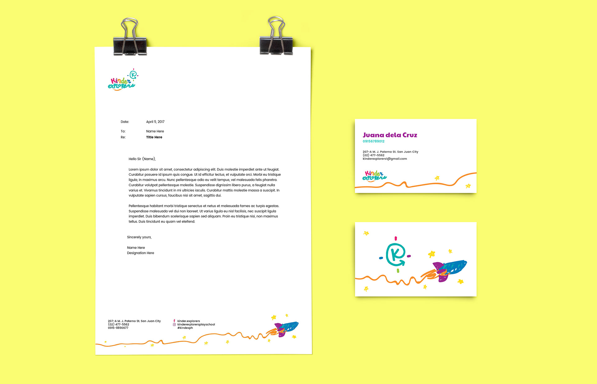
Identity, Storytelling, Illustration
Collaborators:
Jared Vinoya - Additional illustrations
Client: Kinder Explorers
Industries: Education
Deliverables:
Identity, Storytelling, Illustration
Collaborators:
Jared Vinoya - Additional illustrations
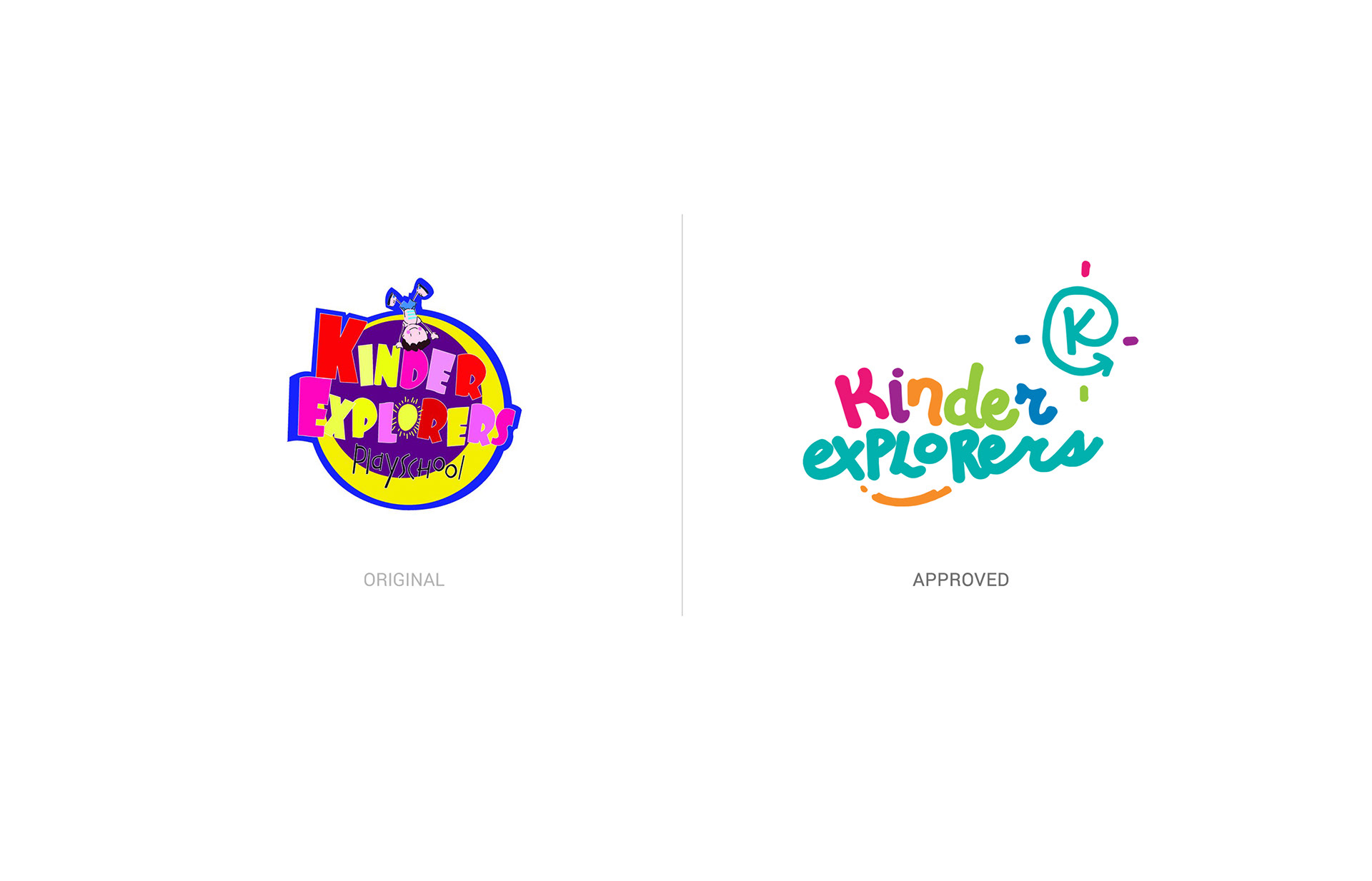
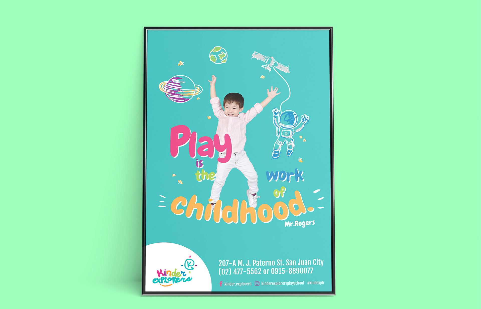
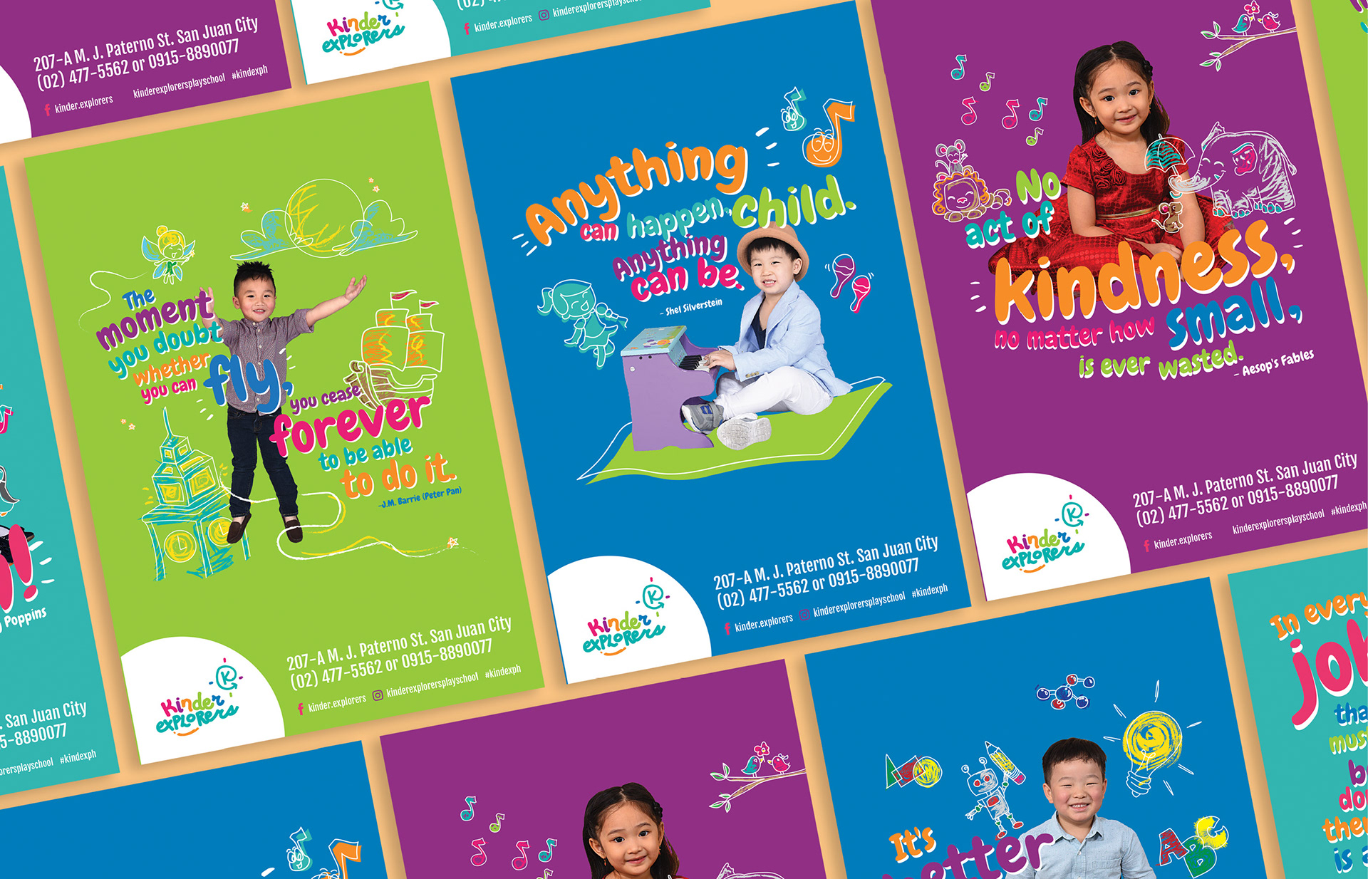
Kinder Explorers is a progressive school situated in San Juan, Greenhills. I was tapped to do the rebrand of the school for better representation of who they as the progressive and fun school they are, and the care they do for the kids.
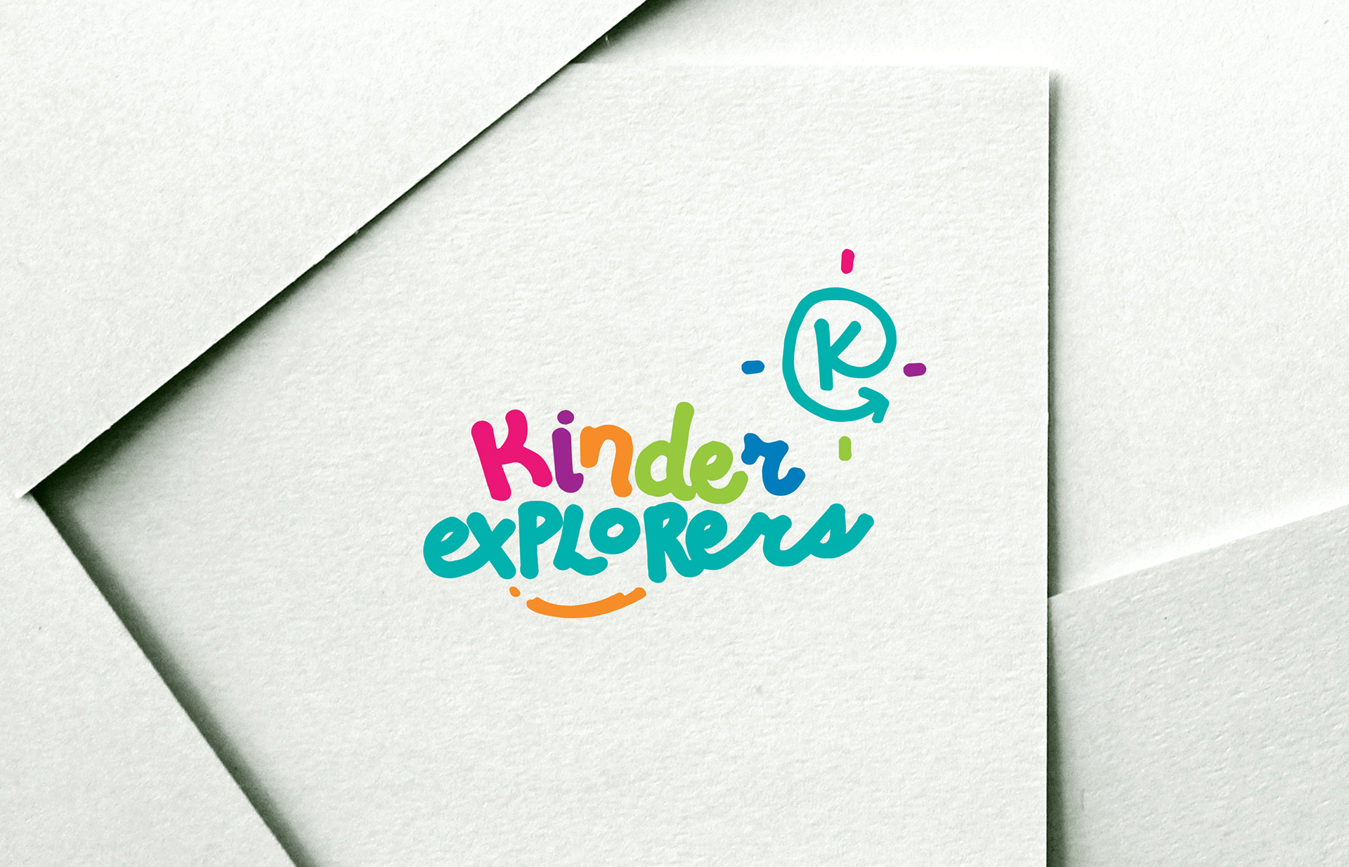
The Kinder Explorers logo is the most prominent visual material the company has and thus the most visible material that we will need to use.
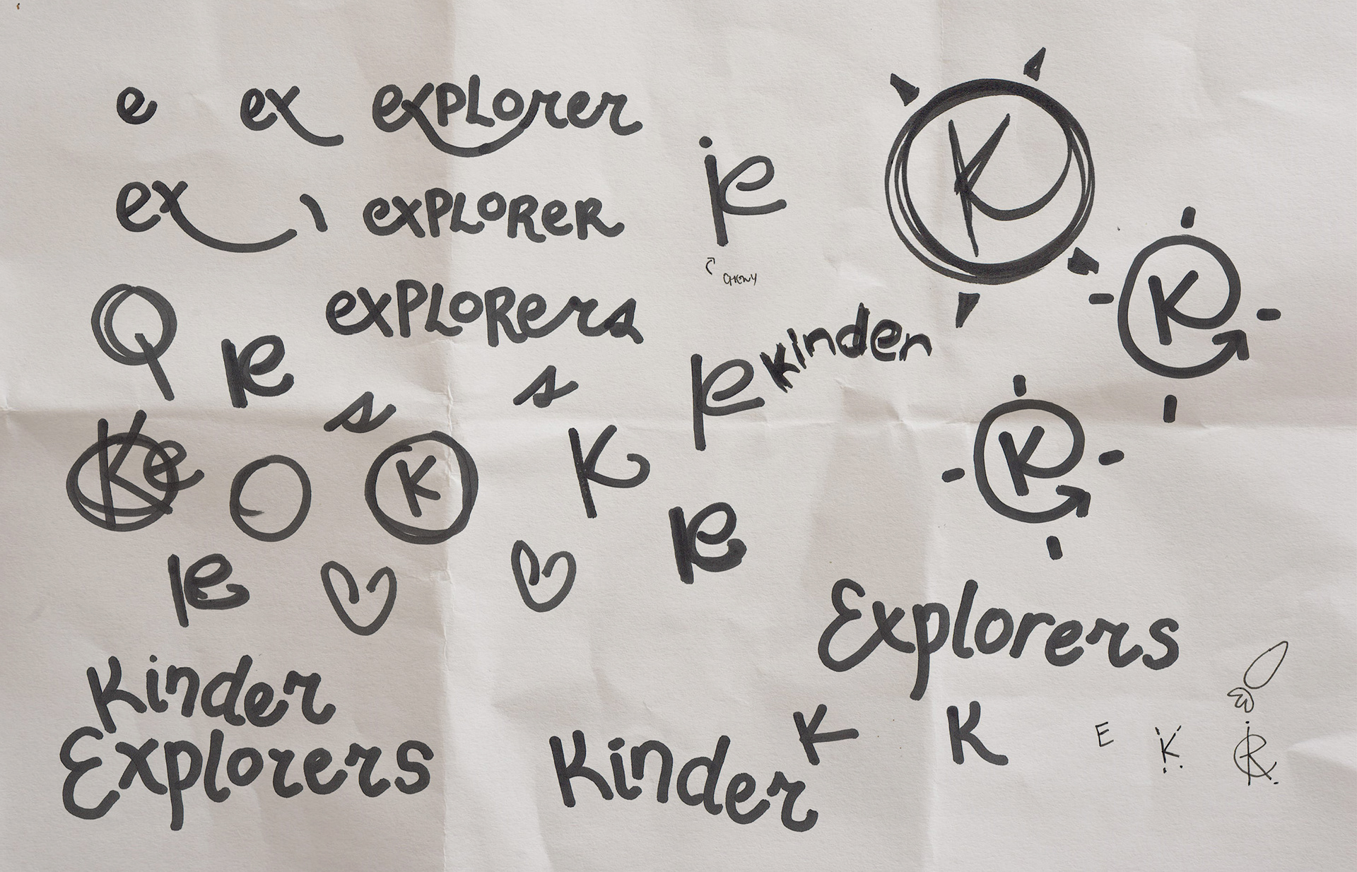
The logo is handmade, imagined to be a child’s own creation, a innocent mark. The “K” signifies the “kid” and placed a circle that formed the bigger “e” for exploration.
The arrow at the end of the “e” much like a line that extends infinitely, showing a never-ending progression for learning.