
Year: 2016
Client: Primrose Kamantigue-Biyo
Industries: Arts and Culture
Deliverables:
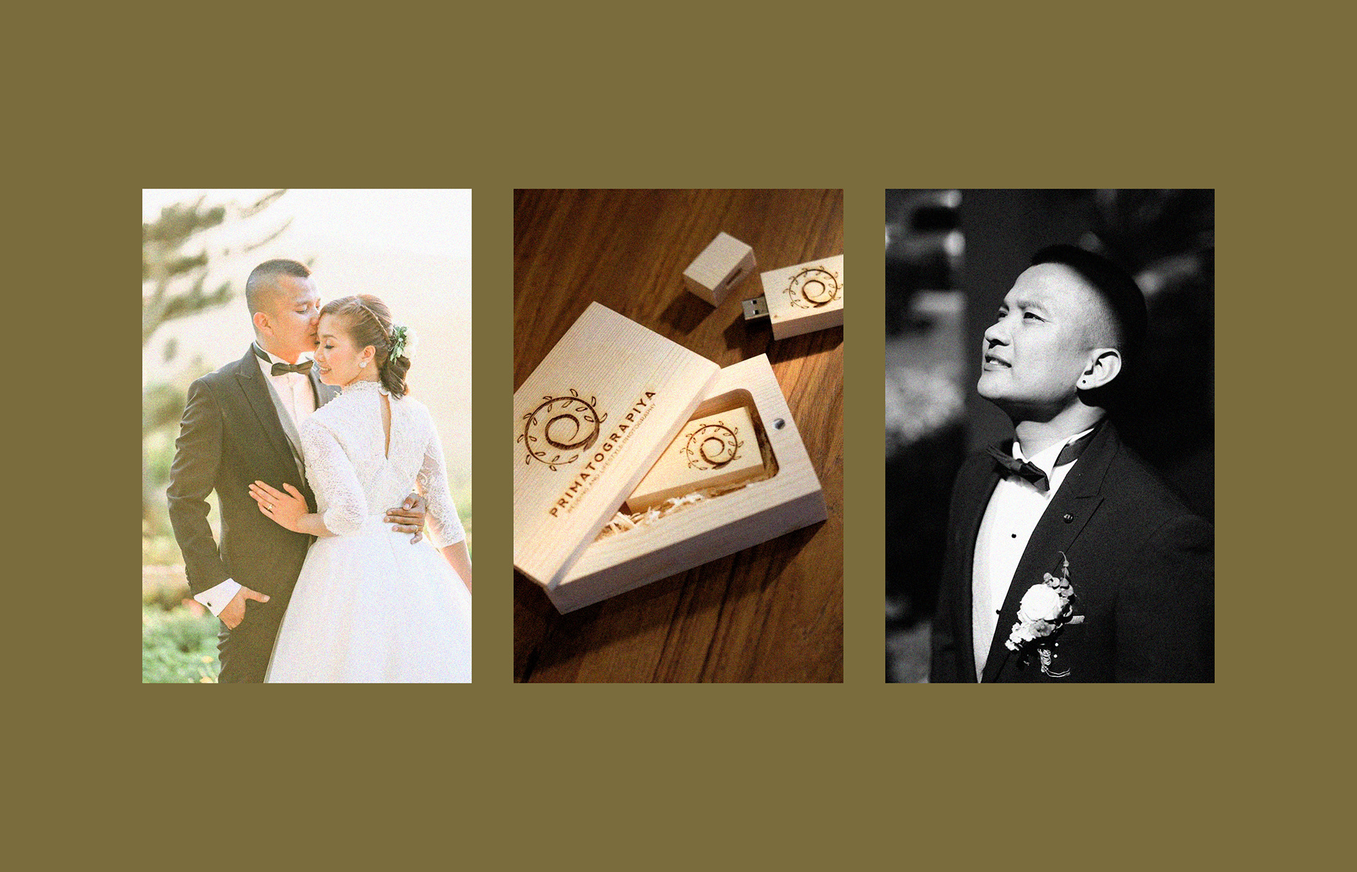
Identity, Packaging, Storytelling
Collaborators:
Primrose Kamantigue (Primatograpiya) - Photography
Client: Primrose Kamantigue-Biyo
Industries: Arts and Culture
Deliverables:
Identity, Packaging, Storytelling
Collaborators:
Primrose Kamantigue (Primatograpiya) - Photography
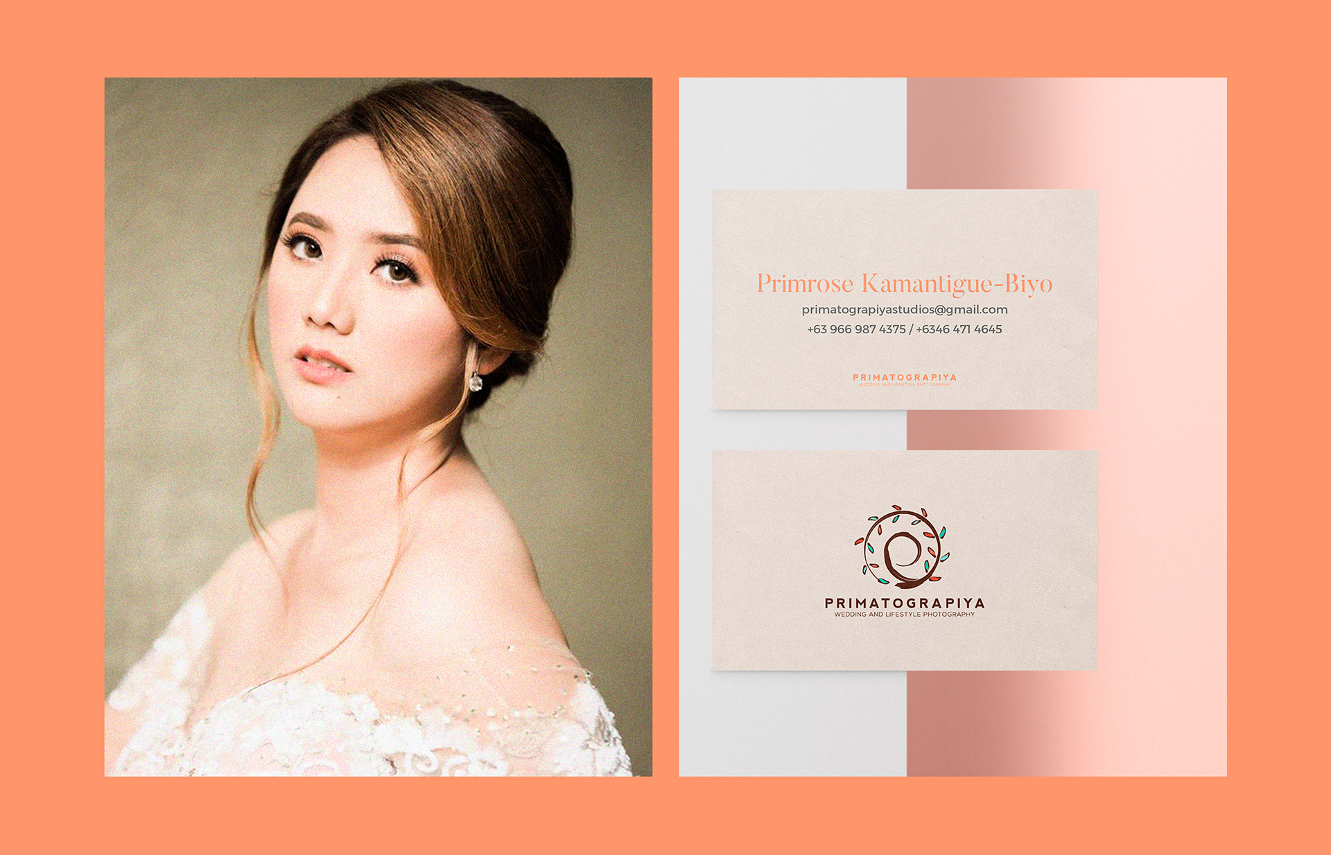
The client, Primrose Kamantigue-Biyo is an artist at her core. Though she has lots of creative ventures, it is photography that captured her the most. From her own words:
"I love taking photographs of people, pretty things, and amazing places in their best light. Being in the same place where the moment happens and able to capture it is one of the most fulfilling part of what I do.
If you are going for the honesty of heartfelt images, vibrance of colors and timelessness, we can be the perfect match."
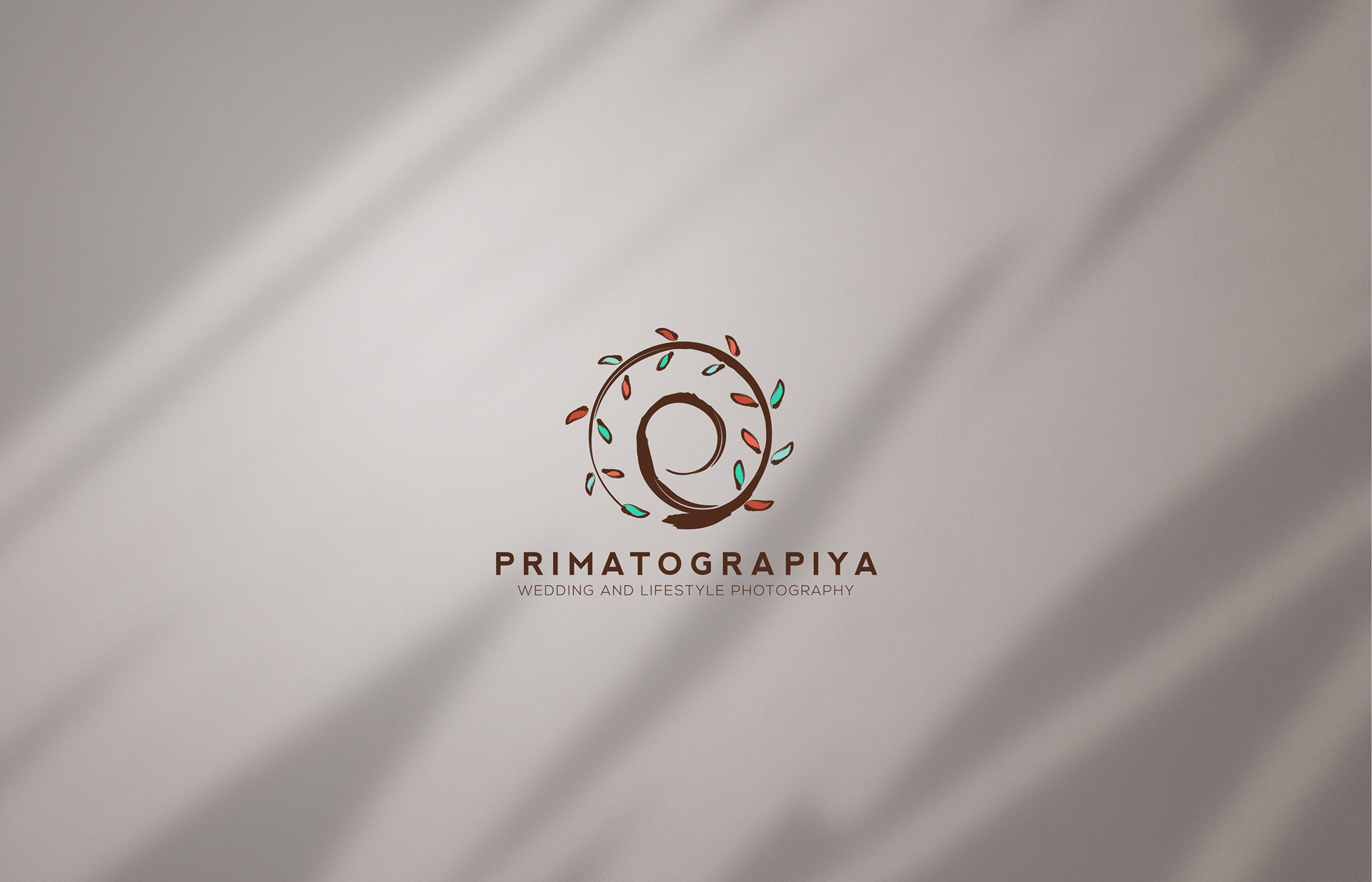
She founded Primatograpiya back in 2012, but it was in 2016 that she saw she needed help in her visual brand to match the light, airy images she has for her clients. Took on the challenge on building the building blocks of the brand which stands strong today.
The logo is inspired by the "Phi" which also means the 'Golden Ratio' and then accentuated by laurel leaves which by history means excellence.